This Flagpost looks at the change in first preference votes to the major parties in the House of Representatives by generation over the past 6 federal elections (2004 to 2019). It is based on data collected by the Australian Election Study (AES).
The AES is a long-standing post-election sample survey run by the Australian National University. There are many opinion polls taken in the lead-up to any election, but with a post-election survey we can see who really voted for whom. Only respondents who gave valid answers to both their first preference in the House of Representatives and their year of birth are included here.
Year of birth was grouped into common Western demographic generations as per the Pew Research Centre:
- Silent Generation: up to 1945
- Baby Boomers: 1946 to 1964
- Generation X: 1965 to 1980
- Millennials: 1981 to 1996.
In other notes on the information presented:
- data is shown as percentages within each generation and election (that is, the 4 data points will sum to 100)
- each generation is the same cohort, ageing 3 years between elections
- numbers used are unweighted
- Generation Z (1997 to 2012) has been excluded as they do not appear in the data before 2016 and are very low in numbers from 2016
- ‘Party’ is the sum of the relevant parties in each state.
The generational groups were crossed with respondents’ first preference votes to the following 4 parties or groups:
- Liberal and National Parties in their various forms (Coalition)
- the Australian Labor Party (ALP)
- the Australian Greens (Greens)
- Other, which includes all remaining candidates: minor parties such as Centre Alliance, United Australia Party, One Nation and all independents.
Figure 1 shows the vote to the 4 parties at the 2019 election by generation. The most noticeable trend is the reduction of the Coalition vote with reducing age and the opposite trend for the Greens and, to a lesser extent, the ALP.
Figure 1: first preference percentage by generation and party at the 2019 election
Source: Australian Election Study 2019, Australian National University
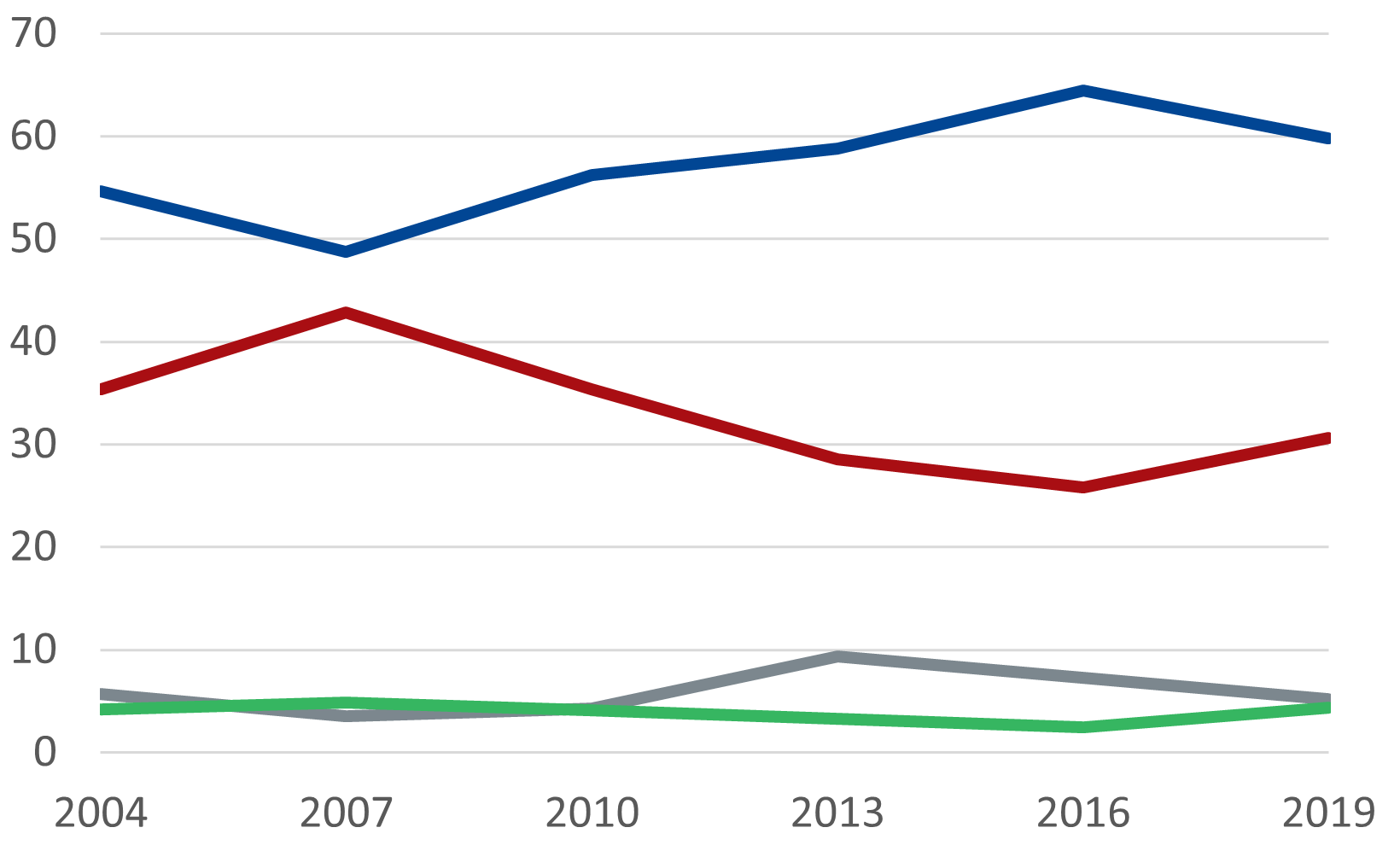
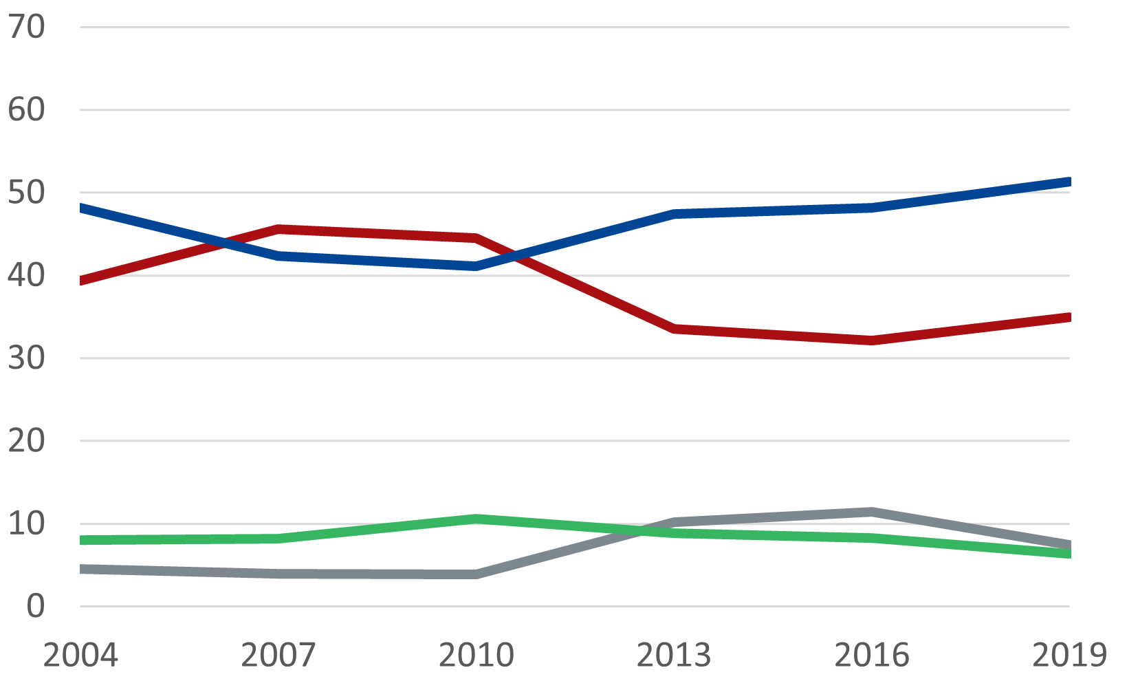
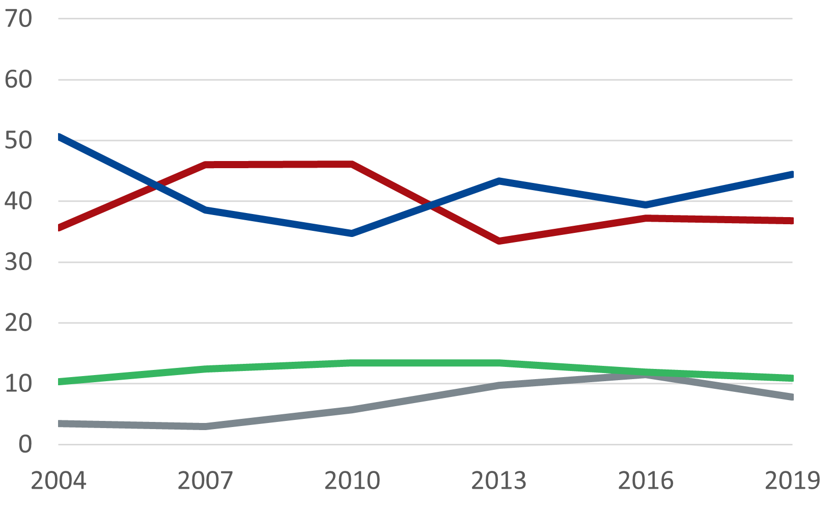
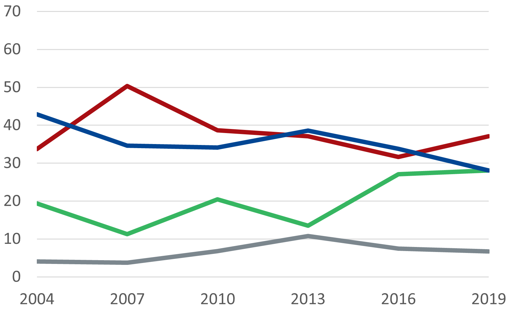
The following 4 charts show the vote to party by generation over the past 6 elections. Party colours are as per Figure 1. The Y-axis in all charts shows a percentage range from 0 to 70 for ease of inter-generational comparison.
Figure 2 shows the Silent Generation’s (born 1945 and earlier) voting pattern since 2004. There is an overall increase to the Coalition and corresponding decrease to the ALP, though like all generations, there is a peak for the ALP in 2007. Their vote to the ALP in the first 3 elections shown were all higher than the last 3 elections. Their vote to the Greens has never passed 5%. Their vote to Other has an average of just below 6%, unlike the other 3 generations, who are closer to 7%.
Figure 2: Silent Generation’s first preference percentage by party, elections 2004 to 2019

Source: Australian Election Studies 2004 to 2019, Australian National University
Figure 3 shows that Baby Boomers’ (born between 1946 and 1964) vote to the Coalition and the ALP follows that of the Silent Generation’s, but with a lower overall vote to the Coalition and higher vote to the ALP (hence the crossover in 2007 and 2010). An increase in their vote to Other at the past three elections seems to be at the cost of the ALP; at the last 3 elections the vote to Other increases by roughly the same amount that the ALP decreases. Their vote to the Greens is stable.
Figure 3: Baby Boomers, first preference percentage by party, elections 2004 to 2019

Source: Australian Election Studies 2004 to 2019, Australian National University
Figure 4 shows that Generation X (1965 to 1980) has had the smallest overall margin between their vote to the ALP and the Coalition and no obvious overall increase or decrease to either. Over 10% vote Greens at each election–—the oldest generation to do so. Their increased vote to Other over the past 3 elections mirrors Baby Boomers and Millennials.
Figure 4: Generation X’s first preference percentage by party, elections 2004 to 2019

Millennials (1981 to 1996) have the most changeable voting patterns. Their vote to the Greens is by far the highest and it is increasing. They had the highest proportion voting ALP for the ‘Kevin 07’ election in 2007, but also the greatest decrease since then. They are the only generation with an obvious overall decline in vote to the Coalition, as Figure 5 shows.
Figure 5: Millennials’ first preference percentage by party, elections 2004 to 2019

Source: Australian Election Studies 2004 to 2019, Australian National University
The charts above show that the differences over time in conjunction with the changes between and within generations have kept the contest between the Coalition and the ALP relatively close: the average two-party preferred winning margin since 2004 is 1.8, the smallest being 0.1 in 2010 and the largest 3.5 in 2013. The War Generation and Baby Boomers are gradually increasing their likelihood of voting for the Coalition as they age. Generation X’s vote to the Coalition has also increased, but the divergence is not as strong. The Millennials’ first preference vote to the Greens is increasing, but because around 80% of people who vote Green preference the ALP, the overall contest between the Coalition and the ALP is brought back to roughly level.